693
Things to know:
- Each candle is one “period” (Hour, Day, Week, Month, etc). So if someone shows you a candlestick chart and says it’s a daily chart, it means each candle represents the prices of 1 trading day. Similarly if they say it’s an hourly chart, it means each candle represents the prices of 1 hour.
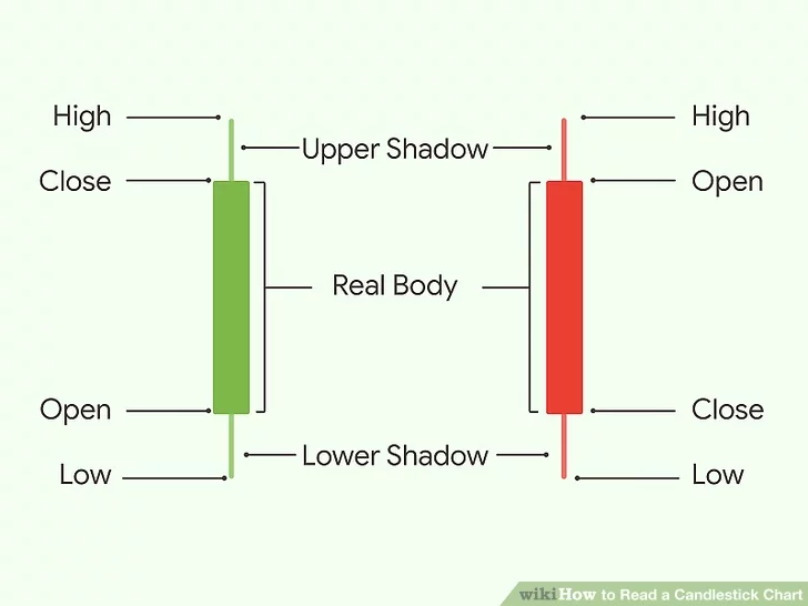
- Green candles indicate that the price closed above the open. Red candles indicate that the price closed below the open.
- The below diagram explains very candidly, each of the components of the candlesticks

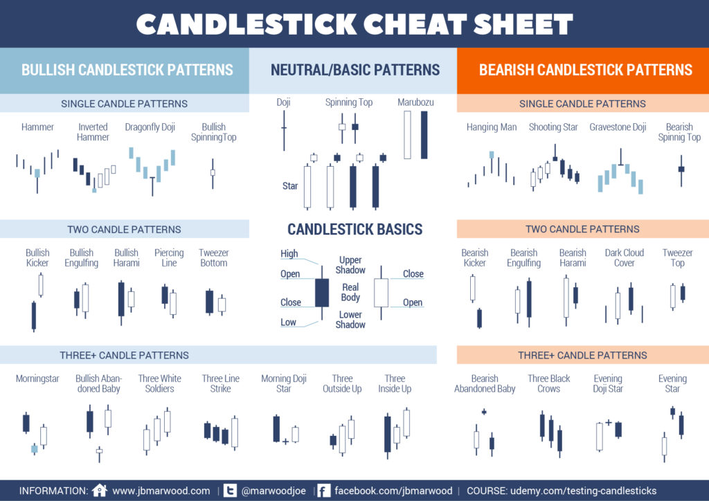
Here’s a list of all the major candle patterns to look out for. Note that these are not cast in stone and are not guaranteed to work, but can give a fairly good idea when seen in context with the trend. (Here black indicates bearish candlestick and white indicates bullish candlestick)

